Typography as a Craft: Lettering, Type Design and History
For intermediate designers who want to look at type as a craft. You will refine letterforms, understand how typefaces and pixel fonts are made, and see how typographic history shapes the tools you use today.
6 lessons · 1 hr 43 min, plus 1 optional (8 min more with the optional lessons)
Start here: a concrete lesson on overshoots, stroke balance and optical consistency in letterforms.
Chris Do refines the letterforms of a logotype, covering overshoots, matching thick and thin strokes, optical balance and comparison with a well-drawn typeface. The video also shows how to draw an "e" in Adobe Illustrator.
Applies the same letterform checks using grids and guides in Illustrator on a hand-drawn script logo.
Chris critiques a hand-drawn script logo and shows how to lay out grids and guides in Adobe Illustrator to spot and correct lettering problems such as stroke widths, overshoots, awkward gaps and balance. It is aimed at designers who already work with hand lettering and logos.
Shifts from technique to attitude, showing how to find your own voice and break rules on purpose.
James Victore argues that choosing fonts and following trends matters less than finding your own voice and making specific work. The video presents ten short rules on typography, from learning and then breaking the rules to avoiding trends and tool shortcuts.
Your first look at type design itself, covering line-based typefaces and a custom workflow in Figma.
Shana Hu gives a short introduction to type design and shows how she used Figma components and plugins to build a custom workflow for line-based and pen-plotted lettering. The talk includes a demo of the plugin she developed.
Widens from making type to the range of pixel fonts and how to use them with clear intent.
A Config 2024 talk by Figma's Director of Design, Marcin Wichary, on pixel fonts. He walks through a large collection of them and argues they remain a rich, approachable canvas for creative design work.
Closes the path with the history of bold type and how it shaped the interface conventions you use today.
A Figma Config talk by Marcin Wichary that traces what happens when you press Command-B in Figma, connecting keyboard shortcuts with the history of typography. It is a conference talk on the craft behind a common design-tool action.
An optional playful object-typography experiment to try hands-on alongside the talks.
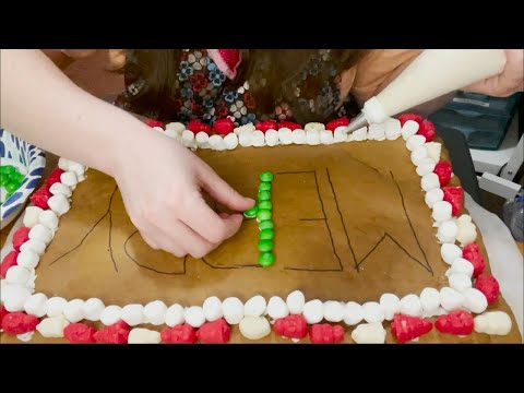
A designer experiments with deconstructed object typography by building a gingerbread house, and reflects on what did not work as planned. It is a playful creative exercise for designers interested in typographic experiments.
For beginners who want to understand interface design and build simple screens in Figma. You will be able to choose colours and type, lay out screens clearly, and polish a design.
For beginners who want to understand branding beyond the logo and take a first brand project from references through to a printed touchpoint and a first look at guidelines. Each step adds one more piece of the identity.
For beginners who want to design logos from scratch. You will learn the main logo types, the principles behind a strong mark, and a full start-to-finish logo process in Adobe Illustrator.
For designers who already know the basics and want to refine their typesetting, build consistent type scales and systems, and work confidently with variable fonts in Figma.
;}.cls-2{fill:%2358d687;}.cls-3{fill:url(%23Degradado_sin_nombre_10);}.cls-4{fill:url(%23Degradado_sin_nombre_31);}.cls-5{fill:%238030d1;}.cls-6{fill:url(%23Degradado_sin_nombre_23);}%3c/style%3e%3clinearGradient%20id='Degradado_sin_nombre_17'%20x1='129.39'%20y1='83.35'%20x2='56.4'%20y2='162.54'%20gradientUnits='userSpaceOnUse'%3e%3cstop%20offset='0'%20stop-color='%23287d8c'/%3e%3cstop%20offset='1'%20stop-color='%2350b5db'/%3e%3c/linearGradient%3e%3clinearGradient%20id='Degradado_sin_nombre_10'%20x1='449.01'%20y1='190.97'%20x2='266.02'%20y2='78.2'%20gradientUnits='userSpaceOnUse'%3e%3cstop%20offset='0'%20stop-color='%23ffe286'/%3e%3cstop%20offset='1'%20stop-color='%23ffcd1d'/%3e%3c/linearGradient%3e%3clinearGradient%20id='Degradado_sin_nombre_31'%20x1='99.7'%20y1='309.69'%20x2='146.19'%20y2='485.35'%20gradientUnits='userSpaceOnUse'%3e%3cstop%20offset='0.01'%20stop-color='%23ff9464'/%3e%3cstop%20offset='1'%20stop-color='%23b3553a'/%3e%3c/linearGradient%3e%3clinearGradient%20id='Degradado_sin_nombre_23'%20x1='547.05'%20y1='208.96'%20x2='252.56'%20y2='438.86'%20gradientUnits='userSpaceOnUse'%3e%3cstop%20offset='0'%20stop-color='%23ff7da1'/%3e%3cstop%20offset='1'%20stop-color='%23f20b4f'/%3e%3c/linearGradient%3e%3c/defs%3e%3ctitle%3efavicon%3c/title%3e%3cg%20id='_Group_'%20data-name='<Group>'%3e%3cg%20id='_Group_2'%20data-name='<Group>'%3e%3cg%20id='_Group_3'%20data-name='<Group>'%3e%3cpath%20id='_Path_'%20data-name='<Path>'%20class='cls-1'%20d='M232.54,165.43a124.47,124.47,0,0,1-106.95,60.76h0A101.77,101.77,0,0,1,23.82,124.41V0L132.31,95.94A517.46,517.46,0,0,0,232.54,165.43Z'/%3e%3cpath%20id='_Path_2'%20data-name='<Path>'%20class='cls-2'%20d='M250,0V101.78a123.87,123.87,0,0,1-17.46,63.65A517.46,517.46,0,0,1,132.31,95.94L23.82,0Z'/%3e%3cpath%20id='_Path_3'%20data-name='<Path>'%20class='cls-3'%20d='M476.18,226.19a518.87,518.87,0,0,1-243.64-60.76A123.87,123.87,0,0,0,250,101.78V0A226.12,226.12,0,0,1,476.18,226.19Z'/%3e%3cpath%20id='_Path_4'%20data-name='<Path>'%20class='cls-4'%20d='M232.54,334.57a517.71,517.71,0,0,0-100.23,69.54L23.82,500V375.59A101.77,101.77,0,0,1,125.59,273.81h0A124.47,124.47,0,0,1,232.54,334.57Z'/%3e%3cpath%20id='_Path_5'%20data-name='<Path>'%20class='cls-5'%20d='M250,398.22V500H23.82l108.49-95.89a517.71,517.71,0,0,1,100.23-69.54A123.87,123.87,0,0,1,250,398.22Z'/%3e%3cpath%20id='_Path_6'%20data-name='<Path>'%20class='cls-6'%20d='M476.18,273.81A226.12,226.12,0,0,1,250,500V398.22a123.87,123.87,0,0,0-17.46-63.65A518.87,518.87,0,0,1,476.18,273.81Z'/%3e%3c/g%3e%3c/g%3e%3c/g%3e%3c/svg%3e)