For beginners who want to understand type styles, choose fonts and set clear text in design tools. You will be able to classify typefaces, build a clear hierarchy and set text in Figma and Affinity.
8 lessons · 66 min, plus 2 optional (17 min more with the optional lessons)
Beginner
Intermediate (not covered)
Advanced (not covered)
What you’ll learn
✓Recognise serif, sans-serif, script and display type and explain the mood each conveys
✓Choose and limit fonts to suit a brand or project
✓Build clear hierarchy with size, weight, alignment and spacing
✓Set and adjust text in Figma and Affinity, including kerning, tracking and leading
Start here: defines typography and shows how to recognise and classify type styles, which the later videos assume.
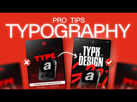
This video introduces what typography is and why it's an essential item in the designers toolkit. It looks at how to recognize and categorize specific styles of type, how to describe types and how to pair fonts together.
Adds the mood and trust each type category conveys, so you can judge what a typeface says before choosing one.
Explains how serif, slab serif, sans serif, script and display typefaces convey mood and trust, using a bank logotype comparison. Aimed at designers choosing fonts for brands and logos.
Turns that knowledge into practice: matching fonts to a brand, avoiding common mistakes and deciding how many to use.
A guide to choosing fonts for graphic and web design, covering how to match fonts to brand emotion, avoid common selection mistakes, decide how many fonts to use, check readability and find free font sites. It is aimed at beginners and social media creators who want more polished typography.
Introduces six quick golden rules on layout and size basics that prepare the ground for hierarchy and spacing.
A quick tutorial presenting six golden rules of typography for graphic design, including layout and size basics, with a short quiz at the end. It suits people new to typography fundamentals.
Explains visual hierarchy through type, scale and layout, which you need before the detailed spacing and alignment tips.
A short graphic design tutorial explaining visual hierarchy beyond size differences, covering hierarchy in typography, scale and layout with visual examples. It is aimed at beginners learning graphic design basics.
Applies hierarchy with concrete rules on size, weight, alignment, grouping and spacing that you can reference.
A tutorial covering five typography principles for posters and layouts: size, font weight, alignment, grouping, and gaps and spacing. It is aimed at graphic designers, content creators and beginners, and ends with a live demo poster built with these rules.
A short optional tip on placing text at the edges of a layout, useful for composition but not essential to the path.
A three-minute tip on when and why to place text on the edges of a layout, framing the layout as a floor plan. It is aimed at designers working on typographic composition.
Moves from principles to practice in the Figma text tool: finding fonts, adjusting text and setting paragraph spacing.
A beginner Figma tutorial covering how to find and use fonts, write and adjust text, change typefaces with shortcuts, and set paragraph spacing, alignment and text fills and effects. It suits designers who are new to working with type in Figma.
Shows the same skills in Affinity, including kerning, tracking, leading and variable fonts, so you are not tied to one app.
A lesson from Affinity's typography series covering installing fonts, adding frame and artistic text, aligning and spacing text, using variable fonts, and creating text styles in Affinity. It is intended for designers learning text work in the Affinity desktop app.
An optional Illustrator tutorial that reinforces scale, negative space and contrast for extra practice.
A beginner-friendly Adobe Illustrator tutorial that covers five typography principles: scale, negative space, typographic tension, readability and contrast. It redesigns weak typographic layouts step by step, for designers making posters, social posts and branding.
For beginners who want to understand interface design and build simple screens in Figma. You will be able to choose colours and type, lay out screens clearly, and polish a design.
For beginners who want to understand branding beyond the logo and take a first brand project from references through to a printed touchpoint and a first look at guidelines. Each step adds one more piece of the identity.
For beginner graphic designers who want to set type well and bring brand thinking into their layouts. You will move from type rules and moodboards to presenting a logo to a client.
For designers who want to build polished, consistent interfaces. You will learn to set type and layout well, then apply design tokens and components across a shared design system.
;}.cls-2{fill:%2358d687;}.cls-3{fill:url(%23Degradado_sin_nombre_10);}.cls-4{fill:url(%23Degradado_sin_nombre_31);}.cls-5{fill:%238030d1;}.cls-6{fill:url(%23Degradado_sin_nombre_23);}%3c/style%3e%3clinearGradient%20id='Degradado_sin_nombre_17'%20x1='129.39'%20y1='83.35'%20x2='56.4'%20y2='162.54'%20gradientUnits='userSpaceOnUse'%3e%3cstop%20offset='0'%20stop-color='%23287d8c'/%3e%3cstop%20offset='1'%20stop-color='%2350b5db'/%3e%3c/linearGradient%3e%3clinearGradient%20id='Degradado_sin_nombre_10'%20x1='449.01'%20y1='190.97'%20x2='266.02'%20y2='78.2'%20gradientUnits='userSpaceOnUse'%3e%3cstop%20offset='0'%20stop-color='%23ffe286'/%3e%3cstop%20offset='1'%20stop-color='%23ffcd1d'/%3e%3c/linearGradient%3e%3clinearGradient%20id='Degradado_sin_nombre_31'%20x1='99.7'%20y1='309.69'%20x2='146.19'%20y2='485.35'%20gradientUnits='userSpaceOnUse'%3e%3cstop%20offset='0.01'%20stop-color='%23ff9464'/%3e%3cstop%20offset='1'%20stop-color='%23b3553a'/%3e%3c/linearGradient%3e%3clinearGradient%20id='Degradado_sin_nombre_23'%20x1='547.05'%20y1='208.96'%20x2='252.56'%20y2='438.86'%20gradientUnits='userSpaceOnUse'%3e%3cstop%20offset='0'%20stop-color='%23ff7da1'/%3e%3cstop%20offset='1'%20stop-color='%23f20b4f'/%3e%3c/linearGradient%3e%3c/defs%3e%3ctitle%3efavicon%3c/title%3e%3cg%20id='_Group_'%20data-name='<Group>'%3e%3cg%20id='_Group_2'%20data-name='<Group>'%3e%3cg%20id='_Group_3'%20data-name='<Group>'%3e%3cpath%20id='_Path_'%20data-name='<Path>'%20class='cls-1'%20d='M232.54,165.43a124.47,124.47,0,0,1-106.95,60.76h0A101.77,101.77,0,0,1,23.82,124.41V0L132.31,95.94A517.46,517.46,0,0,0,232.54,165.43Z'/%3e%3cpath%20id='_Path_2'%20data-name='<Path>'%20class='cls-2'%20d='M250,0V101.78a123.87,123.87,0,0,1-17.46,63.65A517.46,517.46,0,0,1,132.31,95.94L23.82,0Z'/%3e%3cpath%20id='_Path_3'%20data-name='<Path>'%20class='cls-3'%20d='M476.18,226.19a518.87,518.87,0,0,1-243.64-60.76A123.87,123.87,0,0,0,250,101.78V0A226.12,226.12,0,0,1,476.18,226.19Z'/%3e%3cpath%20id='_Path_4'%20data-name='<Path>'%20class='cls-4'%20d='M232.54,334.57a517.71,517.71,0,0,0-100.23,69.54L23.82,500V375.59A101.77,101.77,0,0,1,125.59,273.81h0A124.47,124.47,0,0,1,232.54,334.57Z'/%3e%3cpath%20id='_Path_5'%20data-name='<Path>'%20class='cls-5'%20d='M250,398.22V500H23.82l108.49-95.89a517.71,517.71,0,0,1,100.23-69.54A123.87,123.87,0,0,1,250,398.22Z'/%3e%3cpath%20id='_Path_6'%20data-name='<Path>'%20class='cls-6'%20d='M476.18,273.81A226.12,226.12,0,0,1,250,500V398.22a123.87,123.87,0,0,0-17.46-63.65A518.87,518.87,0,0,1,476.18,273.81Z'/%3e%3c/g%3e%3c/g%3e%3c/g%3e%3c/svg%3e)